
I’m in the midst of completing this case study. Check on later.
Thanks for dropping by!
Digi
Rebuilding the information architecture of Digi’s Sales App
Context
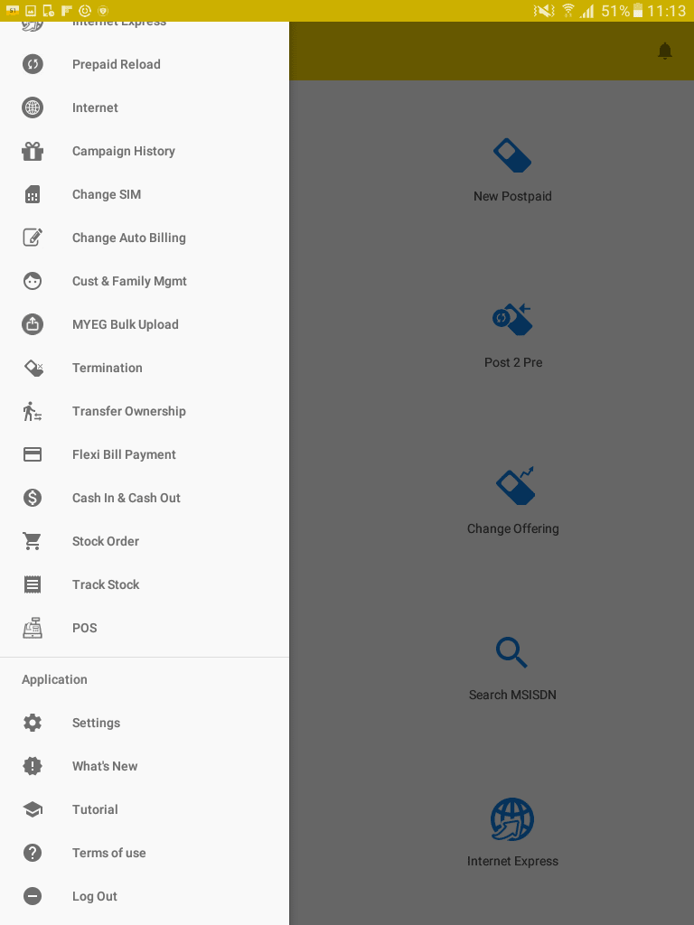
The MSA is a field-critical app used by Digi’s agents and dealers to onboard customers, activate SIMs, configure plans, and process payments. Over the years, new features were added without a unifying structure leading to an overly complex, system-centric experience.
Role
As a Specialist UIUX, I was responsible for driving the end-to-end redesign of the MSA’s information architecture with a focus on clarity, usability, and operational efficiency.

The challenge
The current version of MSA was slowing down Digi’s field operations. Agents were juggling unintuitive flows, and overwhelming menus, all while dealing with customers at the retail store.
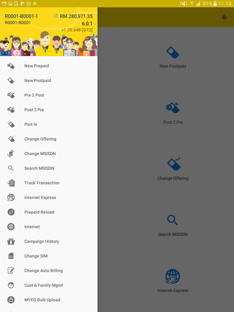
Staggering 24 menus
in level 1 navigation
I’m in the midst of completing this case study. Check on later.
Thanks for dropping by!
❤️
A thank you to Nasuha, Shu, Winnie, my Manager, my HOD and to all Engineering, TPM Jackson, Product Managers specially Azizan, Emily, Sharmaine, Vinod who are involved in this project. Also a special thanks to Telenor’s team who came all the way from Sweden and Thailand on assisting and coaching us to run better research.
Check out other work
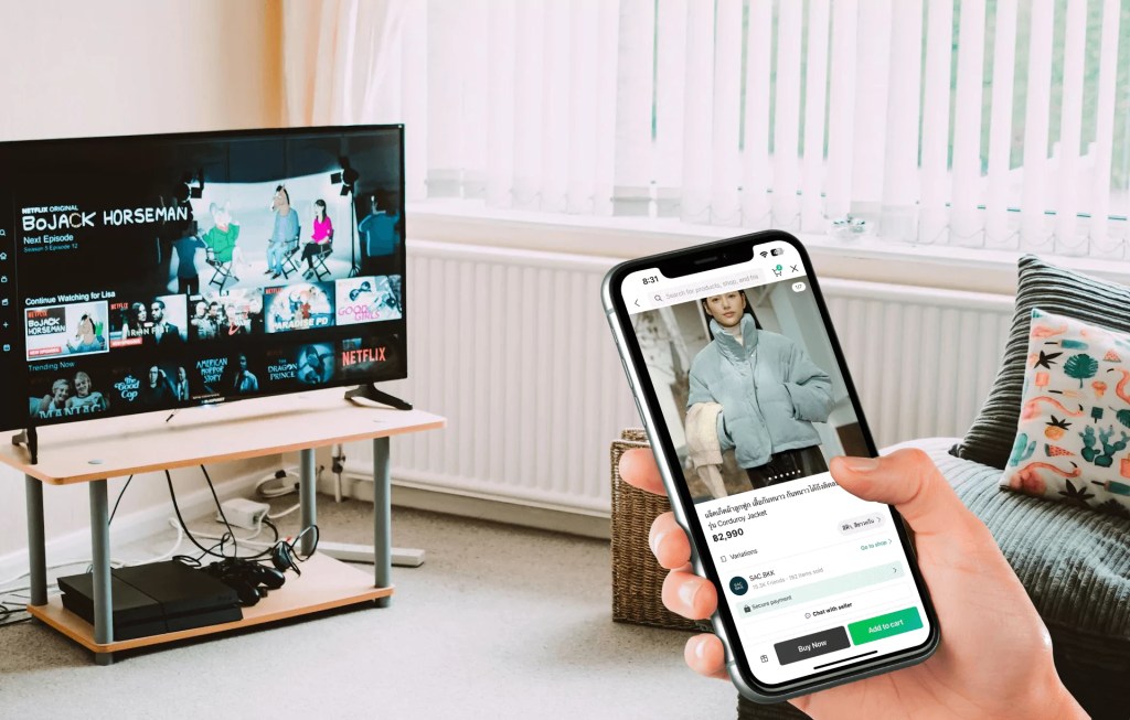
SEEK Asia
Simplifying transitional commercial model through research and iteration
Impact
65%↑
Click-through rate
22%↑
Users adoption
LINE
Case study In Progress
Shaping UX strategy and future experience directions for LINE Shopping
Impact
UX direction
For 2025

Digi
Redesigning the entire digi.com.my with guided experience for clarity and conversion
Impact
10%↑
Increased in AOV
44%↑
In MCR
