-
My everyday “bites”
Extending one of the unused slide from my design talk with you.
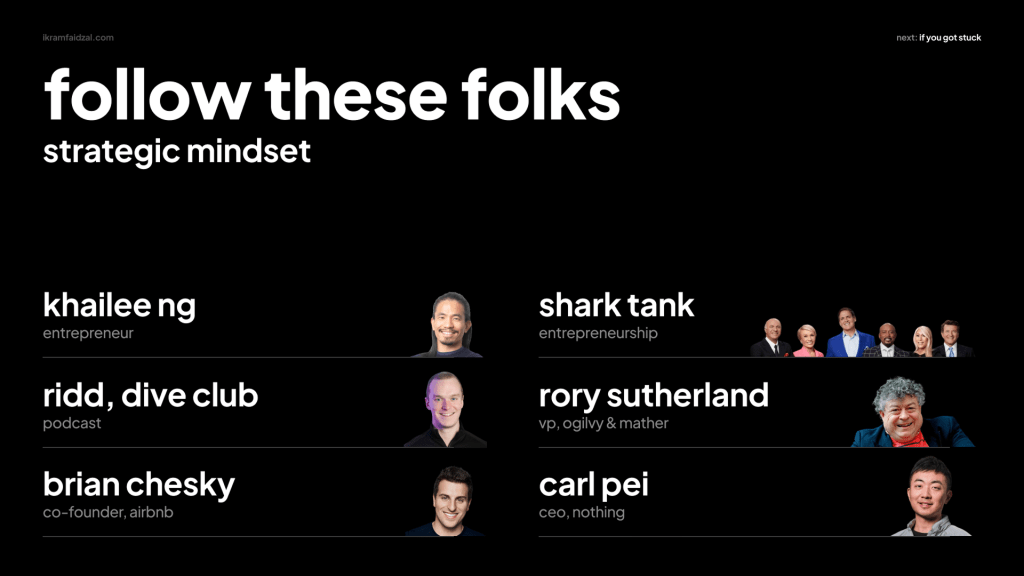
These are some of the people that I follow to elevate my thinking within and beyond design. Particularly on enhancing my pragmatic, critical and strategic thinking.
Worth listening a podcast by Rid with Mig Reyes: https://youtu.be/BVJUmJKrZKA?si=Uu6fpSRcgG0oUYES
Repost and share your thoughts
-
Predictive navigation through behaviour
This is my phone’s home screen. When I swipe down, Siri knows
- Which apps I open frequently,
- What time of the day I use them,
- Where are when I use.
It changed how I navigate around. Less frequent I spent time swiping left and right to find apps. Simply swipe down and the “phone” knows which apps I want to use/visit given the time of the day.
My take on this:
- The way users navigate has changed, shaped by AI. This shift due to the rise of short-form and algorithm-driven content. Less about having full-fledged, well-designed information architecture (IA). It’s about having predictive navigation through behaviour and embedding it into the content.
- Though, don’t get me wrong, users probably would still appreciate having the core navigational structure as a foundation for browsing purposes if they got stuck.
- So, if you’re currently/planning an effort to revamp your IA, consider this technique and embed it into your products/service.
Patricia Reiners✨ shared her insights beautifully on this topic through her podcast. Worth a listen: https://open.spotify.com/episode/5dKhUcubQ2i8ogWfJWF7S1?si=qrfrof_fSdmP92yXTFLFAA&nd=1&dlsi=3f87839ac9c24438
Repost and share your thoughts
-
User vs Customer vs Consumer
I was in a meeting discussing the redesign of our product’s Information Architecture (IA for short). There were many different stakeholders in the room. People were throwing their ideas here and there. Throughout our conversation, I listened and observed that many would use phrases like “…for our users,” “…this can also be good for our consumers,” and “if we are going to redesign how our visitors interact with…”
Then, I got confused. Further, I asked, “Can we take a moment and pause—what is our definition of Users, Customers, Consumers, and some also use Visitors?”
When they say “Users,” “Consumers,” or “Visitors,” they are actually talking about the same definition—which is the end user. The one who is interacting with our product. Yet, we are all using different labels to identify them.
Sure, there are much bigger problems in the digital product space than correcting how people address or label their types of users.
However, here’s how I would challenge you on the other side of the coin: Isn’t it considered a bare essential for all stakeholders (yes, including designers) to understand the correct way to label them? Allow me to paint a (hopefully) easy example to understand this.
Imagine you have a Lego bricks:
User
The person who plays the Lego
Customer
Someone who buys the Lego. The one who pays
Consumer
Someone who plays with and benefits from Lego bricks
My point here is you need to get the label right, as it will influence your narrative throughout building your product. Plus, if you get your label right, it will help to correctly segment your personas.
Let’s have a look at a real-world example. Say, you work at Figma.
User
A designer who using Figma as their design tool
Customer
The company or person who pays the subscription or seats
Consumer
It could be Product Manager, Engineers, Copywriter
Get it?
Repost and share your thoughts
-
Delightful experience
How would you design delightful experiences for users? Many would start drilling their Figma boards with user flows and trying to find unnecessary screens to remove.
Let’s take a step back.
Remember when you were a small kid and your uncle or auntie secretly handed you sweets? Then you started doing non-stop small jumps, jumping in excitement. Do you remember how joyful you were?
The big question is: how do we replicate that joyful memory in designing experiences for product design? I invented a very simple technique. I called it “What is our cherry on top?” Let me break it down.
“Cherry on top” is a technique where you bring your Figma board into the spotlight, focusing on one screen at a time, or choosing only one screen within your user flows. Within your selected screen, brainstorm what would be the one thing you could add, change, or remove. The expected narrative when your users interact with what you have added, changed, or removed would be expressions like “Oh, this is nice!”, “It’s refreshing!”, or “I thought that was cool!”
Here are a few examples I could use to illustrate the technique. Back in 2011, in their early days, do you remember when Instagram allowed you to double-tap to like photos? Wasn’t that simple yet so efficient? I don’t know about you, but for me it was “Huh… easy and somehow making me want to keep double-tapping the next photo I see.” Second, remove any redundant copy in your copywriting. Look for things like exclamation marks. Some products overuse them hoping to gain more attention. Lastly, play with micro-interactions. Add that fade in-out effect when users press that beautiful cta button of yours.
The rules are simple. Firstly, do not create a separate meeting for discussing Cherry on top. It should be part of your design review agenda, else it would defeat the whole purpose. Secondly, discuss Cherry on top before you hand off the design to the Engineers. Thirdly, select one screen only from your user flows.
So how do you run the technique? In the meeting, prompt that question to everyone. For the first 5 minutes, do the silent brainstorm. Let everyone stare at the design screen. The next 10 minutes are for people to share their ideas. Then spend 5 minutes discussing technical feasibility. Flooded with ideas? Great—that’s a good problem to have. If you’re in that scenario, do a quick vote. Pick only one and move on. That’s it.
So, next time in the meeting remember to ask “What is our cherry on top?”
Good luck!
Repost and share your thoughts
-
Designers, be strategic
In my past experience as an Individual Contributor, I remembered being asked to present the work to the CMO, Chief Marketing Officer. The design nerd in me talked about how good the design was and how I was able to optimise the experience of the product. At the end of the session, I thought “It went pretty ok.” Literally right after the meeting, I was dragged by my manager and told, “Bro, I think you should highlight the big picture. Not the detail where the menu should be placed.” I was confused at the time. I didn’t understand what she meant by “big picture.” All in my head was, doesn’t the CMO need to hear and know the details and how I designed the experience?
Such a big ego in me on not asking my manager what does she meant, instead, I googled-it. One article after another, I still don’t understand. Time has passed.
Fast forward, I have found the simplest way to train your thinking. There is a popular framework that many consultants use in their presentations called “The Minto Pyramid”.
I thought Ryan Rumsey illustrated Minto Pyramid greatly. Let’s look at the example:

Minto Pyramid 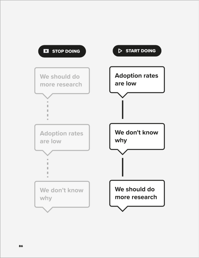
Storytelling The trick is pretty simple: Start by slowly zooming out, from one level to a higher level. Structure your storytelling into three layers. First layer is Situation. Second is Complication. Third is Resolution.
Let me break it down for you. So, when you’re being asked to present your work,
Start with Situation
“Currently, our adoption rates are low.”
Followed by Complication
“We don’t exactly know why.”
Lastly, Resolution
“We should do more qualitative research to understand the whys”
Again, most designers communicate their storytelling starting from the Resolution—which you want to avoid if you want to communicate your plan effectively, be it to your manager, stakeholders, or senior leadership.
Remember the Minto Pyramid technique next time you’re communicating your design. Good luck!
Repost and share your thoughts
-
Beyond design leadership: Part One
“I hope you’re well”.
One fine afternoon, I sat down with one of my designers. It was one of my routines where I do bi-weekly catch-ups, traditionally known as one-on-one. During the talk, I noticed her expression and mood was gloomy. It was not her usual behaviour pattern.
Abruptly I asked
“Hey, are you OK?”
She replied
“Yeah, I’m OK”
I asked again
“Are you really OK? Looks like you have a lot on your mind. I’m all ears and here for you.”
She shed tears
“No, I’m not really OK. My dog died…”
I was speechless. I didn’t know how to respond to that heartbreaking news. Didn’t know what to say. I was crying inside.
Too personal for me to cover the entire conversation here.
Dear leaders, if there’s anything, I want to remind myself and you: When you’re asking people “How are you?”, take a step back and ask like you really mean it. Say it with deep care. Say it with your heart. You’ll be amazed how simple that question may be, yet it can be so powerful.
In your next catch-up, remember to not just “hope.” Don’t say “I hope you’re well.” Instead, ask, “How are you? Are you really OK?”
Repost and share your thoughts
-
Subscribe
Subscribed
Already have a WordPress.com account? Log in now.
